 My Account
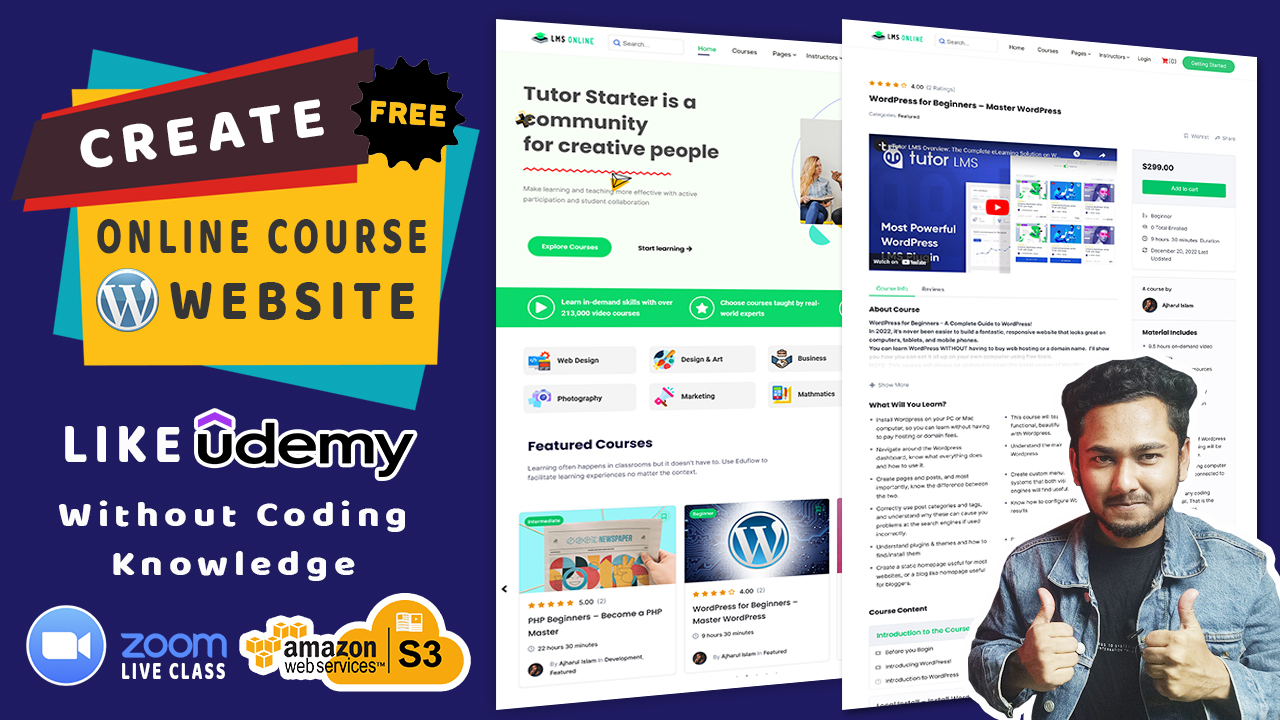
Are you looking to create a multi-instructor WordPress LMS website to provide online courses? I will show you how to make this website step by step and you don’t need to know any coding knowledge.
I will show you how to design this website with elementor drag and drop page builder. I have used free wordpress theme, plugins, and free resources.
Important Links
- Get Domain and Web Hosting from Hostinger (75% Discount)
- Download TutorStarter Theme (Free)
- Download Tutor LMS Plugin (Free)
- Elementor Page Builder (Free)
- WooCommerce (Free)
- Get Tutor LMS Pro Version (Paid)
Assets
Shortcodes
Login page - [tutor_login]
Course List - [tutor_course orderby="Date" order="desc" count="9" column_per_row='3'
course_filter='on']
Student Registration – [tutor_student_registration_form]
Instructor registration – [tutor_instructor_registration_form]
Dashboard – [tutor_dashboard]
CSS Animation Code
/*CSS Animation*/
.image-up-down {
    -webkit-animation: mover 1s infinite  alternate;
    animation: mover 1s infinite  alternate;
}
.image-up-down {
    -webkit-animation: mover 1s infinite  alternate;
    animation: mover 1s infinite  alternate;
}
@-webkit-keyframes mover {
    0% { transform: translateY(0); }
    100% { transform: translateY(-20px); }
}
@keyframes mover {
    0% { transform: translateY(0); }
    100% { transform: translateY(-20px); }
}
/*1st Animation*/
.animation-png1{
    animation: linear 10s firstCustomAnimation infinite;
}
@keyframes firstCustomAnimation {
    0% {
        transform: translate(0px, 0px) rotate(0deg);
    }
    20% {
        transform: translate(73px, -1px) rotate(36deg);
    }
    40% {
        transform: translate(141px, 72px) rotate(72deg);
    }
    60% {
        transform: translate(83px, 122px) rotate(108deg);
    }
    80% {
        transform: translate(-40px, 72px) rotate(144deg);
    }
    100% {
        transform: translate(0px, 0px) rotate(0deg);
    }
}
/*2nd Animation*/
.animation-png2{
    animation: linear 10s secondCustomAnimation infinite;
}
@keyframes secondCustomAnimation {
    0% {
        transform: translate(0px, 0px) rotate(0deg) scale(1);
    }
    20% {
        transform: translate(73px, -1px) rotate(36deg) scale(0.9);
    }
    40% {
        transform: translate(141px, 72px) rotate(72deg) scale(1);
    }
    60% {
        transform: translate(83px, 122px) rotate(108deg) scale(1.2);
    }
    80% {
        transform: translate(-40px, 72px) rotate(144deg) scale(1.1);
    }
    100% {
        transform: translate(0px, 0px) rotate(0deg) scale(1);
    }
}
/*3rd Animation*/
.animation-png3{
    animation: linear 10s thirdCustomAnimation infinite;
}
@keyframes thirdCustomAnimation {
 0% {
        transform: translate(61px, -99px) rotate(0deg);
    }
    21% {
        transform: translate(4px, -190px) rotate(38deg);
    }
    41% {
        transform: translate(-139px, -200px) rotate(74deg);
    }
    60% {
        transform: translate(-263px, -164px) rotate(108deg);
    }
    80% {
        transform: translate(-195px, -49px) rotate(144deg);
    }
    100% {
        transform: translate(-1px, 0px) rotate(180deg);
    }
}
[class^=“elementor-“] p {
    color: unset;
    font-size: unset;
    font-weight: unset;
    text-transform: unset;
    line-height: unset;
}


 USD $
USD $  BDT ৳
BDT ৳